تایپوگرافی در وردپرس کلید طراحی وب خوب است. آن بر تجربه کاربری و هویت برند تاثیر میگذارد. بنابراین انتخاب قلمهای مناسب ضروری است. فونتهای درست، خوانایی، دسترسیپذیری و زیباییشناسی را بهبود میبخشند. این مقاله توضیح میدهد که چرا تایپوگرافی اهمیت دارد و چگونه از آن در پوستههای وردپرس استفاده شود.
فهرست مطالب
چرا تایپوگرافی در وردپرس مهم است
تایپوگرافی نحوه تعامل کاربران با سایت شما را شکل میدهد. قلمهای واضح، خواندن محتویات را آسان میکند. علاوه بر این، تایپوگرافی خوب بازدیدکنندگان را مشغول نگه میدارد، نرخ پرش را کاهش میدهد، و برندسازی را تقویت میکند. علاوه بر این، فونتهای دسترسیپذیر به کاربران با مشکلات بصری کمک میکنند تا راحتتر سایت را پیمایش کنند.
بهترین الگوها برای انتخاب قلمها
در این بخش، تعدادی از مهمترین الگوها برای انتخاب قلمها برای شما آورده شده است.
1. اولویتبندی خوانایی
خواندن قلمها باید آسان باشد. بنابراین، شکل حرف واضح، فاصلهگذاری مناسب و کنتراست متعادل را انتخاب کنید. فونتهای سنس-سریف مانند Roboto یا Lato برای متن بدنه (محتوا) خوب عمل میکنند.
2. گزینههای قلم را محدود کنید
استفاده از فونتهای زیاد میتواند طراحی را درهم و برهم کند. در عوض، از دو یا سه عدد، یکی برای عنوان، یک برای متن بدنه، و به صورت اختیاری یک فونت لهجه (accent) استفاده کنید. مطمئن شوید که آنها با هم از نظر سازگاری ظاهری، مطابقت دارند.
3. استفاده از قلمهای وب ایمن و فونتهای گوگل
برای سازگاری بهتر، فونتهای ایمن وب یا فونتهای گوگل را انتخاب کنید. به خصوص فونتهای گوگل، گزینههای رایگان و بهینه ارائه میدهند که به سرعت بارگزاری شده و خوب خوانده میشوند.
4. تنظیم اندازه قلم مناسب و ارتفاع خط
اندازه قلم و ارتفاع خط (line height)، تاثیر معنیداری بر خوانایی دارند. در حالت ایدهآل از اندازه فونت 16px تا 18px برای متن بدنه با ارتفاع خط 1.5 تا 1.75 استفاده کنید. علاوه بر این، عناوین باید بزرگتر و با فواصل مناسب باشند.
5. حفظ کنتراست مناسب
اطمینان حاصل کنید که متن بخوبی با پسزمینه کنتراست (ضدیت) داشته باشد. متن تیره روی یک پسزمینه روشن معمولا بهتر است. با این حال، طرحهای رنگی را برای دید بهتر آزمایش کنید.
6. استفاده از قلمهای متغیر برای عملکرد بهتر
فونتهای متغیر (variable)، در یک فایل سبکهای چندگانه ارائه میدهند. در نتیجه، آنها درخواستهای HTTP را کاهش داده و سرعت بارگزاری را بهبود میبخشند. پوستههای وردپرس میتوانند از این قلمها برای طراحی و عملکرد بهتر استفاده کنند.
پیادهسازی تایپوگرافی در وردپرس
در پوستههای بلوکی وردپرس و درون ویرایشگر سایت، یک قسمت مجزا و کامل به تنظیمات فونت اختصاص دارد.
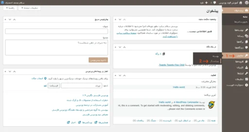
کافی است ابتدا مطابق عکس زیر به ویرایشگر سایت مراجعه کنید:
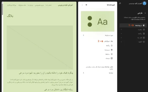
سپس با انتخاب شیوهنامهها > تایپوگرافی، به این قسمت دسترسی داشته باشید.
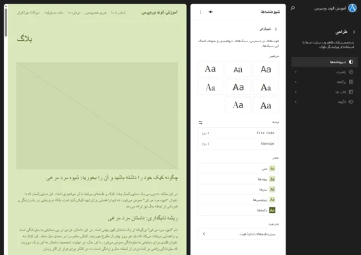
تنظیمات تایپوگرافی زیادی شامل حروفچینی، فونتها، عناصر و اندازه فونت را در این قسمت میتوان انجام داد.
همچنین میتوان بسیاری از تنظیمات قلمها را در فایل theme.json (واقع در پوشه ریشه پوسته) وارد کرد.
برای مثال جهت اضافه نمودن فونت جدید، نمونه کد زیر را ببینید:
{
  "$schema": "https://schemas.wp.org/wp/6.9/theme.json",
  "version": 3,
  "settings": {
    "typography": {
      "fontFamilies": [
        {
          "slug": "primary",
          "fontFamily": "Tahoma, sans-serif"
        },
        {
          "slug": "secondary",
          "fontFamily": "Times New Roman, serif"
        }
      ]
    }
  }
}
یا برای افزودن اندازه فونت، نمونه کد زیر را به کار بگیرید:
{
  "$schema": "https://schemas.wp.org/wp/6.9/theme.json",
  "version": 3,
  "settings": {
    "typography": {
      "fontSizes": [
        {
          "name": "Extra Small",
          "size": "14px",
          "slug": "xs"
        },
        {
          "name": "Small",
          "size": "16px",
          "slug": "sm"
        },
        {
          "name": "Medium",
          "size": "20px",
          "slug": "md"
        },
        {
          "name": "Large",
          "size": "28px",
          "slug": "lg"
        },
        {
          "name": "Extra Large",
          "size": "36px",
          "slug": "xl"
        }
      ]
    }
  }
}نتیجهگیری
تایپوگرافی در پوستههای وردپرس حیاتی است. فونتهای خوب، خوانایی و تجربه کاربری را بهبود میبخشند. بنابراین، فونتهای واضح را انتخاب کنید، سبکها را سازگار نگه دارید، و بهترین الگوها را دنبال کنید. اگر از این مراحل پیروی نمایید، پوسته شما عالی به نظر میرسد و خوب عمل خواهد کرد.


دیدگاهتان را بنویسید